THE BRIEF
Genova için marka değiştirme zorluğu çok yönlüydü; şirket, çağdaş bir kitleye hitap etmek için eskimiş görsel kimliğinden kurtulması gerekiyordu, ancak uzun süredir var olan müşteri tabanıyla kurduğu güveni korumak zorundaydı. Bu geçiş sadece kozmetik değildi; bu, Genova'nın sürekli ilerleyen bir endüstrideki evrimini ve kalite ve inovasyona olan taahhüdünü iletişim kurma ile ilgiliydi.
The name 'Genova' resonates with the seafaring heritage of Genoa, a pivotal port city in Italy, mirroring the company's global reach in shipping electronics. The deep blue hues in the logo are a tribute to the Ligurian Sea, while the bright accents of orange represent the vibrant energy of the city's historic maritime commerce.
This subtle nod to Genoa's legacy not only grounds the brand in a rich tradition but also aligns it with the dynamic flow of modern trade.
ELECTRIFYING INNOVATION
Genova Industrial Products redefines the landscape of electronic importation with its striking rebranding.
In the world of industrial might and electronic innovation, Genova stands as a beacon of progress. Bridging the gap between tradition and cutting-edge technology, Genova's rebranding isn't just a new look, it's a bold statement of global connectivity and enduring quality. This is where legacy meets modern efficiency, crafting a narrative of reliability and forward-thinking that resonates across continents.
THE OUTCOME
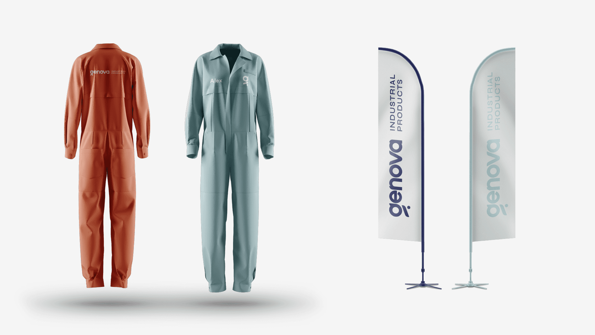
The revitalization of Genova’s branding has been met with enthusiastic approval from both legacy and new clientele. The modern, bold aesthetic has expanded its appeal and fortified the brand’s message of innovation and quality. The new logo, featuring sleek typography and dynamic colors, has rapidly become synonymous with Genova’s high-quality industrial products, propelling the brand into its next chapter of global trade.


