07
Electronica Global: The Genova Industrial Evolution
Genova Industrial has established itself as a pivotal conduit in the global electronic components supply chain. Headquartered in China, the company has been instrumental in bridging the gap between eastern manufacturing prowess and western market demands.
Specializing in the export of premium electronic components to key international markets, particularly Turkey and the USA, Genova has been a silent yet significant player in the industry.
CLIENT
GENOVA INDUSTRIAL
ROLE
BRANDING SPECIALIST
RESPONSIBILITIES
DESIGN, CREATIVE
YEAR
2023
THE BRIEF
The rebranding challenge for Genova was multifaceted; the company needed to shed its dated visual identity to appeal to a contemporary audience while preserving the trust built with a longstanding customer base. This transition wasn't just cosmetic; it was about communicating Genova's evolution in an ever-advancing industry and its commitment to quality and innovation.
The name 'Genova' resonates with the seafaring heritage of Genoa, a pivotal port city in Italy, mirroring the company's global reach in shipping electronics. The deep blue hues in the logo are a tribute to the Ligurian Sea, while the bright accents of orange represent the vibrant energy of the city's historic maritime commerce.
This subtle nod to Genoa's legacy not only grounds the brand in a rich tradition but also aligns it with the dynamic flow of modern trade.


ELECTRIFYING INNOVATION
Genova Industrial Products redefines the landscape of electronic importation with its striking rebranding.


THE COST
MOUSE CLICKS
THOUSANDS
ESPRESSOS CONSUMED
COUNTLESS
BURNT CPU'S
A FEW

In the world of industrial might and electronic innovation, Genova stands as a beacon of progress. Bridging the gap between tradition and cutting-edge technology, Genova's rebranding isn't just a new look, it's a bold statement of global connectivity and enduring quality. This is where legacy meets modern efficiency, crafting a narrative of reliability and forward-thinking that resonates across continents.

THE OUTCOME
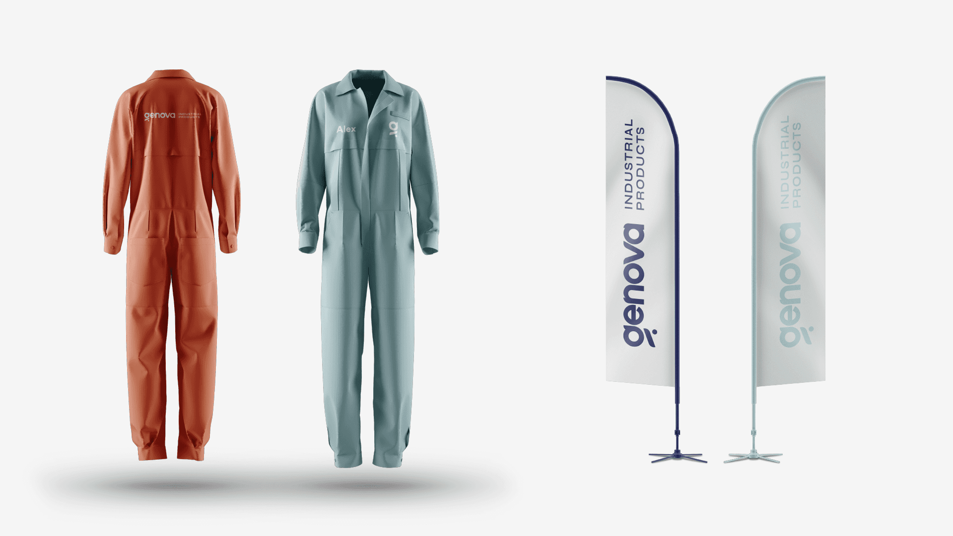
The revitalization of Genova’s branding has been met with enthusiastic approval from both legacy and new clientele. The modern, bold aesthetic has expanded its appeal and fortified the brand’s message of innovation and quality. The new logo, featuring sleek typography and dynamic colors, has rapidly become synonymous with Genova’s high-quality industrial products, propelling the brand into its next chapter of global trade.